-Please use the pages section to navigate to print experiments.
-Research and Ideas generation will appear on the 'research' section.
-Developement for Stage 2 of the module will appear in 'Research and Development' section

25 Feb 2011

MWORE Lanterns!

A few more experiments... They're horribly made and rushed, but i was experimenting with black and white card and a bit more with the silhouettes. 

Hansel and Gretel Lantern
This is a lantern based upon the popular Hansel and Gretel fairytale, which is one of the darkest one. Involving a child eating witch and said witch being pushed into an oven.
I chose a less macabre part of the tale, showing the children approaching the gingerbread house, and a crow eating the trail of crumbs behind them, cutting off their exit. 


I like the way it turned out, layering the cut out elements over a bold illustration of trees etc, helps to set the scene well and gives a really interesting look and feel. Giving the design a border and flourishes around the curved sides gives it a more gothicy feel, mimicking gothic architecture and the art nouveau movement.

Detail of Red Riding Hood Lantern

Upclose photo of the Red Riding Lantern showing the bold background of trees, and how it highlights the characters and frames them. 


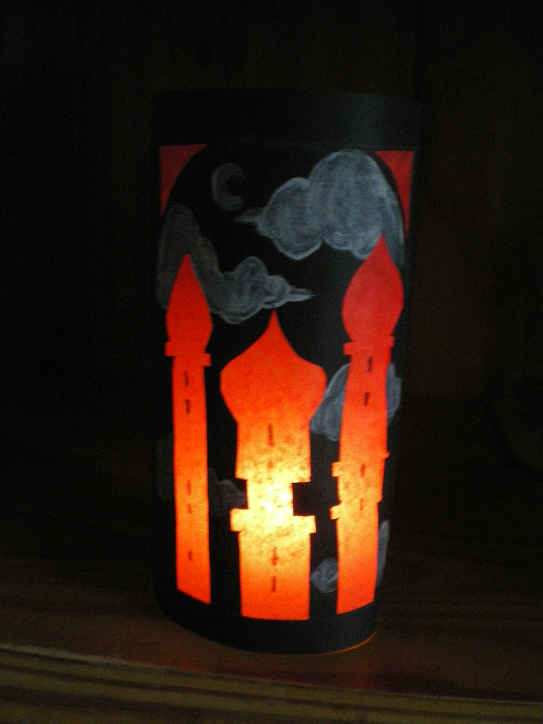
Arabian Nights lantern

Here was a quick experiment with black card and painting white clouds behind the arabian style buildings. The black lanterns has a much darker feel and highlights the red light up bit very well. In the darkness you only really see the buildings and the clouds, so the design seems to be floating in the gloom, which looks very cool. 


24 Feb 2011

Little Red Riding Hood Lantern Mock-up

This is the first mock up design for the fairytale lanterns, this one representing Little Red Riding Hood. I chose this fairytale as it is very well known and I could easily make it darker by exaggerating the proportions of the wolf against the little girl, and i could alter proportions to make it look more elongated and creepy. 


I made it by first drawing a design of trees and a house onto the paper with pen, and coloring it in to simulate the boldness of a lino print. I then cut out the design of the wolf and little red with a scalpel before sticking red tissue paper behind. After placing the lantern over a light [in this case a candle] it shows through the tissue paper, giving off a red light and illuminating the scene. 


I really love the look, and when i make the proper ones, Ill use lino to give a bolder [and quicker] background that i could experiment with, using different colors. I will use the laser cutter to cut the designs, as it ill give me a much cleaner line compared to using a scalpel and it will be a lot quicker and precise so that If I were to create many, it would take much less time. 


It sticks the to theme of 'Prints of Darkness' in more ways than one. The subject matter being fairly dark and sinister due to the stylisation of the illustrations and using reds and black, but also the actual product itself. They are base upon shadow lanterns, so the idea of shadows and light work well with the theme. 

23 Feb 2011

Lantern Ideas

Searching for cut-out paper lanterns I came across this simple lantern. Gave me a great idea to utilize this technique using the laser cuter, but print on the paper before hand [using lino] to make a more complex scene.


Id like to draw up some designs but for now, an initial idea would be to print a simple background onto the paper, then cut out a character over the top to give a shadow puppet like feel. 
I could then create a ring with the paper [like above] and place it over a light or a candle to let light through. 
This could be used in a dining room for example or a restaurant. It may even work in a children's bedroom to cover a night-light. 

Also, this blog 
 Gave me the initial idea behind the lazer cut lantern idea. These stools gave me the idea of making a lanterns out of cut out panels of wood/card and slotting them together to make a box shape. 

The lanterns may very well end up looking similar in design to the stools, using patterns on the panels maybe like the one above. Obviously the middle area would be cut out to let light through, but its just and idea at the moment. 


Heres and example of the cut out pieces that eventually become the stools etc. This will help if I go further with the idea. 

17 Feb 2011

Shadow Lanterns

Inspiration for Shadow Lanterns, that I could make using the laser cutter.
I could create the lantern case with the laser cutter [making a basic open faced box] and then print silhouettes onto slightly transparent material/paper and cover the open sides. The box/lantern could be placed over a glass with a tealight in to create a light. 
This product could be used domestically in a bedroom for example of maybe in a restaurant.


Symbols/pattern cut out from what looks like something similar to a upturned coffee tin. They create really beautiful patterns against the wall behind. 


Lantern like box, with black silhouettes over tinted material [could be glass or something semi transparent]. Light inside would project the images onto a nearby wall and suit as simply a light. 


Sourced from Google Images

16 Feb 2011

Stage 2 Moodboards


Focusing on the theme 'Prints of Darkness' and interior products.
Interested in silhouette/shadow puppet style artwork as an area to explore. 


Moodboard looking at colour through 'interior' theme. Wallpapers, artwork and materials. 
Colour range going from dark in top left to light in bottom right. 
Images taken from Creative Review and Home and Garden magazines/journals. 


Interior design moodboard, looking at pattern, texture and interior products with a dark theme. 
Images taken from Creative Review and Home and Garden magazines/journals. 

8 Feb 2011

Emma Ahlqvist- Drypoint

Amazingly cute etchings by Emma Ahlqvist, showing the delicate lines that can be achieved with the process, and the range of textures one can produce.
Her etchings are so different from even a drawing, they seem to withhold a delicacy that you couldn't replicate with a pencil. I love the grimeyness of the prints which give a lovely texture.
Very simple prints, but look detailed somehow and very pleasing on the eye.


David Shenton- Lino Prints

Comic book style lino prints produced by David Shenton [his work known as 'The Shentons']
Complex six colour lino prints in a really interesting comic style, looking like frames from a comic
book or graphic novel. 
Flat areas of colour achieved by the lino print, but small areas of texture add a home-made
feel and make the image seems much more appealing than a standard
digitally rendered illustration.
Really Inspiring work. 


Chris Bourke- Lino Prints

Beautiful bold lino prints by Chris Bourke
Black and white lino prints using single lino and colour. I really love the bold
designs that look as if they were created digitally due to the sharp blacks and white,
yet retain the natural rustic-ness of the varying line width that you get from 
cutting into the lino.
His works are sometimes edited digitally afterwards to achieve a cleaner effect and to use on skateboard designs for example.
They have a very tattoo like feel due the black and white nature of the design, and the detailed yet simplistic style that is often found with tattoo designs.