25 Mar 2011
Evaluation
I evaluated my product in the revious post, but overall im fairly happy with the project and think it pushed me out of cmy comfort zone well, ad opened up my mind to new ways of working. I found the first part of the project to be difficlut, as there was alot of things to do in a short amount of time, but after starting thr second part, i found more time to settle down and produce the work well.
19 Mar 2011
Final Lantern
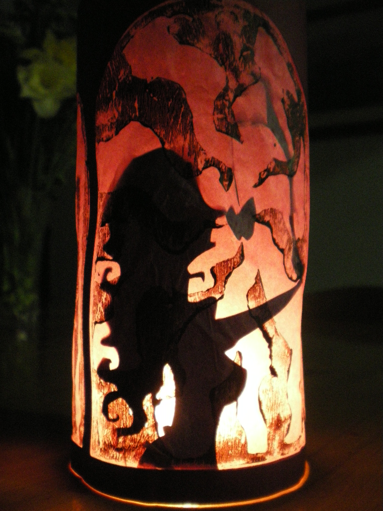
My Final Lantern-


These photos show the the four panels with a light behind them. Overall I really like how it turned out, and due to the nice papers I used the lanterns looks just as beautiful without a light behind and they do with. Unfortunatly my camera seems to have drained the colour from the photos, but in real life they show really lovely greens and reds that complement well with the black frame of the lanterns.
The lino prints add a nice subtle backgroud and without a light behind, they obscure the snow white image well so that its not so easy to see her. [Which is what I wanted]
I turned out a little bigger than thought, but It came out well because it could be placed over a light as opposed to a candle which makes the frames look brighter.


These two photos show the lantern in a possible context. For this example, I chose a table setting, with the flowers and wine glass symbolizes this. I think would look really nice as a table setting for a themed fairytale wedding or a themed restuarant. The colours are subtle enough but still in this example especially bring out the colours of the other elements of the table setting, ie the red wine and the green of the plant.
It wouldnt be used as a light source with candles alone [there are candles hidden behind the plant] but i think if placed over an lamp the light would be strong enough to be on its own and may even project the images onto a near by wall.
12 Mar 2011
Victorian Silhouettes
Inspiration behind the Snow White silhouettes. All based upon the silhouette style portraits that were popular in the Victorian period.


Sourced from Google Images
11 Mar 2011
Final Experiments
I got hold of some beautiful semi-transparent papers [thank you Christine!] that I thought Id play with in place of paper or tissue paper on the lanterns, and they came out really well!

Here I used a green peice that had little trees printed on it, and put it behind a cut out and printed hansel and gretel lantern to see what it looked like. I love the colour you get when you put a light behind it, and it really stands out against the black and the white and looks very sickly thanks to the green.
I definatly think I am going to go further with these papers as they are much stronger than tissue/normal paper, and they give a lovely effect.
Here are the first cut out designs of the snow white lanterns.
I used the laser cutter to cut out the lanterns panels, then printed a mixture of acrylic and poster paint over the paper before sticking it behind the cut out. I then put the snow white figure behind the paper so that in normal light, snow white can hardly be seen, but when put over a candle or other light, she shines through.
It helps to create an almost eerie look to the lanterns, and give an bit more gothicness to the tale.

I used the green paper here over the second snow white, which gives a really gothic and sickly feel which compliments the idea that in this panel she is being suffocated by the bodice ribbons. The cloud lino print dosent show too well in the photo, but does in real life and creates a nice subtle background.
You also get a nice texture from the print on the paper, which gives an organic feel that contrasts with the smooth lines of the cut-out elements.

With this panel, I used normal paper and printed a purple cloud design over it before sticking it behind the frame. When put over a light, it creates a nice warm glow and the figure shows through, but it does looks rather dull with no light behind, and i think it is too white.
The paper also creases and buckles during the printing which gives an unpleasant look.

I used greaseproof paper here and printed over that. I dont like the look, as it is too transparent and the print dosent look very nice, far too textured and broken up.

This was simular to the first experiment with the green paper, but this time using the red/purple paper that gives a really nice effect. Its looks really gothic but pretty at the same time and compliments the beauty of the figure. The piece looks just as good without a light behind it so Im defiantly going to use the green and the red papers in the final design as they looked really good.
In these experiments, i used purple card to cut out the lantern frame, and although it looks nice, i think if I used black, it would create a much better contrast against the light up area and give a more gothic Victorian feel.
All my Lovely Lanterns!
Ideally they'd have lights behind in them all..
But I don't have enough candles, and I could set the house alight...


These are all the experimental lanterns ive made, looking at different coloured papers and cards to use on the outside, as well as different colours and materials for the inside to let light through. I also experimented with the lino printing, as I did the printing at home I had to see what paints/inks would work best and give an even coverage.
Overall its been quite fun to play around with the colours and layering up on materials and using the laser cutter. I think they've all helped to come up with a great final design as my ideas have constantly changed and so too have the images and illustrations I used.
10 Mar 2011
Dale Newton
Concept work and screeshots of 'The Tale of Three Brothers' a short animated sequence in 'Harry Potter and the Deathly Hallows'
Dale Newton had been on my radar as soon as I began the second part of the project and Ive been in love with the short animation sequence in the latest Harry Potter film for some time.
The concept work as well as the stills from the film all share a really interesting shadow puppet/silhouette style which coupled with the gothic way they are drawn, creates a really spooky but also beautiful set animation.
The elongated figures and the disproportion of them have influenced my work particularly with the snow white designs, and helped to make mine more gothic and spooky.
His work shows just how many textures and effects you can get from the simple idea of placing silhouettes behind a screen and projecting light behind. I know that the animation and illustrations were created digitally, but the same principle is implied and the effect is the same.
These works have inspired me throughout the completion of this project. And Ive only added them here now due to realising how influential they have been in the design process.


8 Mar 2011
Dark Fairytales Research
Scans from 'Faeries' by Brian Froud and Alan Lee
[Sorry for terrible scans... Scanner was having a bad day]
Fairytales aren't always about little children and monsters, sometimes FairyTales are literally about 'Fairies', yet most aren't the typical christmas fairy we think off.
The term 'Faeries' is used to describe a whole range of fantastical beings ranging from the cute and harmless to the cut-throat and sometimes terrifying. Brian Froud and Alan Lee describe these creatures wonderfully in this book and the illustrations are as beautiful as they are disturbing in places.

I love the silhouette look of these faerie island, they could be a good background for a fairytale scene. It shows that silhouettes of the mundane, through stylisation can looks magical and unreal. The detailed and intricate shapes make beautiful and otherworldly looking lands.

Creepy looking faerie thanks to the hunch posture and spindly, spiderlike limbs. The green foliage on its back give it a more nature feel and make it seems less threatening, but Its still pretty creepy.

Silhouette again, just the fact that it is black against the blue/grey background makes the scene look instantly darker and foreboding, even though a boy walking up to a tree may not be spooky if it were coloured normally.

Scary goat man. Exaggerated features make him look very spooky, and the white eyes give him an ethereal and malevolent look.

Elongated claws and extremely large makes this hag look very spooky. The frame around it also bumps up the gothic and creepy effect.

I dont like the eyes, they unsettle me.
And the disproportion of the hands and the thinness of the arms and legs make him look very skeletal.
Ive drawn influence from these character and styles of drawing throughout the development of the characters in the my work, and think they've really helped to make my designs look spooky and gothic.
7 Mar 2011
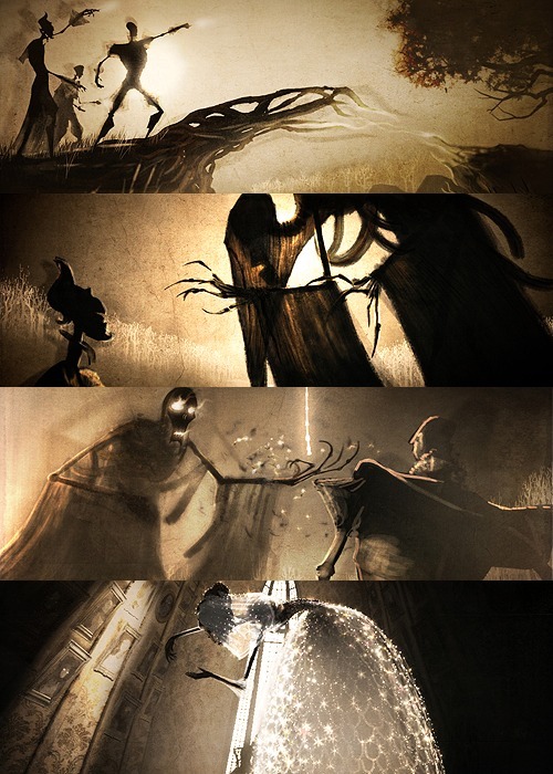
Snow White Designs
These are the finished designs for the snow white lantern I am planning.
After experimenting with the shadow puppet style lanterns, I much prefer the look of them and think that exploring the idea of making a 4 panelled lantern to be much better then the cylindrical light covers that Ive been previously making.
These 4 panels show 4 elements from the tale of snow white, and show it in a gothic Victorian style that compliments the idea of a shadow lantern.

The first panel shows a normal Snow White, holding a rose. this panel is supposed to present her as a beautiful young lady, of which she is described as in the tale.
The second one shows her being strangles/suffocated by the bodice ribbons that are given to her by the evil queen in hope that they will kill her. I chose to really exaggerate the strangling aspect and show the pain that she must be experiencing.
The third panel shows the poison comb that the queen gives her, again to kill her. It shows her hair all over the place as if it has gone wild, and the dropping of the comb hopefully hints at this aspect of the story.
The final panel shows the apple, that i've explored before. This is the most well known element of the tale and is instantly recognisable as being from snow white, as my peers have said when I've shown them.
The lantern will become almost like a story book, or infact a shadowplay telling the gothic and dark story of Snow White.
[Please refer to the sketches and design work in the sketchbook/workbook that Ive also submitted, for more on the development of the 4 panels]
6 Mar 2011
Shadow Puppet Lanterns
After playing with putting the cut out characters behind a paper, i made a quick mock up of a lantern made up of 4 frames with a window cut out and paper stuck where the window is. It creates a very simple lantern that I could elaborate on and make more intricate thanks to the ease of the laser cuter.
[This one was cut out with scalpel, so the edges are very rough and it is basic]


Here are photos of the basic lantern with Red Riding and Snow White cut outs stuck behind the paper. They show through really well and it looks just like something the could be in a [gothic themed] restaurant or even something to go on a table setting at a fairytale themes wedding or something similar. They may even be great to use as a table setting in a seated theatre or at a snow white show.


This is another quick mock up, with an 8 sided lantern [4 panels folded in half] which creates a much nicer shape and isnt so rigid like the square lantern above. This shows a quick mock up of how i may represent the 4 elements of the story of snow white. The normal Snow White figure, the bodice ribbons, poison comb and the apple. These designs arent final, more like place holders at the moment to see how they would look.
I really love the pale purple clouds against the soft warm glow of the candlelight and it contrasts really nicely with the black frame of the lantern.
Even as a rough experiment it still looks very 'pretty' but also gothicy. I defiantly want to elaborate on this idea but play around with the designs of the panels.
Snow White Lanterns
Here is the Snow White lantern design, printing white clouds over the dark red card, and then using red/purple tissue paper for the design.

The white stands out really well here, and i love the gothicness of pose and the way the clouds in the background look to be emanating from the apple. It worked just as I had planned. Although I think the cut out bit is a little large, and you dont necessarily see all of it from one view which makes it loose its impact.


Here are the sides of the lantern, using lino again to create an arch like flourish and cuting out an area of it to frame the central design. I really love having the extra flourished at the side as it really gives and art nouveau feel and the spirals compliment the spirally clouds.

With this lantern, I elaborated on the shadow puppet style lanterns but this time used tissue paper, and put the cut out snow white behind that. Overall I dont like the texture that the lino printing gives on the tissue paper and its much too unstrudy and dosent looks very nice without a light behind it.
I dont think ill peruse further with the tissue paper idea.
4 Mar 2011
Laser Cut Designs!

Lino printed and cut out Red Riding Lantern. I really love the texture of the lino print in the background and the cut out characters have a really nice edge due to the laser cutter. The red of the tissue paper works well against the dark red of the card and the black lino design.
However, the black dosent stand out very well in dim light, so part of the design is lost when the lanterns is placed over a light but the surrounding area if dark.

Hansel and Gretel lantern. Rough lino print from experimenting with printing media. I dont think the card was wet enough, and i used mostly acrylic to print with so the paint might have dried out a bit after continually rolling it out with the roller.
Although, it does give it a really gritty and grungy texture which contrasts with the smooth cut out line of the characters and the boldness of the light up area. The white stands out much better against the black in dim light.


The three were created by putting the cut out bits inside a roll of normal paper, then placing that over the candle. Its gives a lovely effect that looks like shadow puppets. I love the way some elements are blurred due to them not being stuck properly, and although not intentional it looks really interesting and i could use it to create nice textures in the otherwise flat designs.
I want to look into this shadow puppet style a bit more, and put more of the cut out bits behind different papers to see how they appear after put the infront of a light.
1 Mar 2011
'Lantern' designs
Here are the three main designs that I want to experiment with. I have created the backgrounds separately so that I can print them out and trace them onto the lino and the pruple/red bits are also separate and as illustrator vector files to be cut out on the laser cuter.
The plan is, to print the black background onto the card first so I know where to cut the design. The laser will then cut the characters etc out of the card with the lino print. Ill then put tissue paper behind, and voila! I have lanterns!
Hansel and Gretal

Simple forest background to set the scene, and cut out children, house and crow. Im hoping to have purple toned paper in the cut out sections to give it a dark feel.
Little Red Riding Hood

The same simple forest background, and cut out Wolf and Little Red. Its not as strongly rooted to the fairytale, as the wolf is abit obscure but it still presents a rather spooky looking feel due to the proportions of the two characters together. Ill use red paper behind the cut out bits to reflect the 'Little Red Riding Hood' bit.
Snow White

Simple cloud like background coming from the apple to show its not a normal one. Its creates a basic setting that dosent distract too much from the main figure. There isnt really one setting for Snow white [unlike Red Riding which is set in a forest], so the background isnt as important.
I chose to make a Snow White lantern aswell, because it is one of my favourite fairytales stories and I could make it very gothic and stylized, drawing upon influences from victorian silhouette portraits and the art nouveau movement which seemed to praise the female form.
Its also a very dark and macabre tale in some place, obviously not talking about the Disney version. The evil queen tries to kill Snow White many times with various tricks and this is the aspect I want to focus on.
This lanetern shows Snow white about to take a bite out of the apple which will send her to sleep. [i think in the original tale, its kills her.]
25 Feb 2011
MWORE Lanterns!
A few more experiments... They're horribly made and rushed, but i was experimenting with black and white card and a bit more with the silhouettes.
Hansel and Gretel Lantern
This is a lantern based upon the popular Hansel and Gretel fairytale, which is one of the darkest one. Involving a child eating witch and said witch being pushed into an oven.
I chose a less macabre part of the tale, showing the children approaching the gingerbread house, and a crow eating the trail of crumbs behind them, cutting off their exit.


I like the way it turned out, layering the cut out elements over a bold illustration of trees etc, helps to set the scene well and gives a really interesting look and feel. Giving the design a border and flourishes around the curved sides gives it a more gothicy feel, mimicking gothic architecture and the art nouveau movement.
Detail of Red Riding Hood Lantern
Upclose photo of the Red Riding Lantern showing the bold background of trees, and how it highlights the characters and frames them.

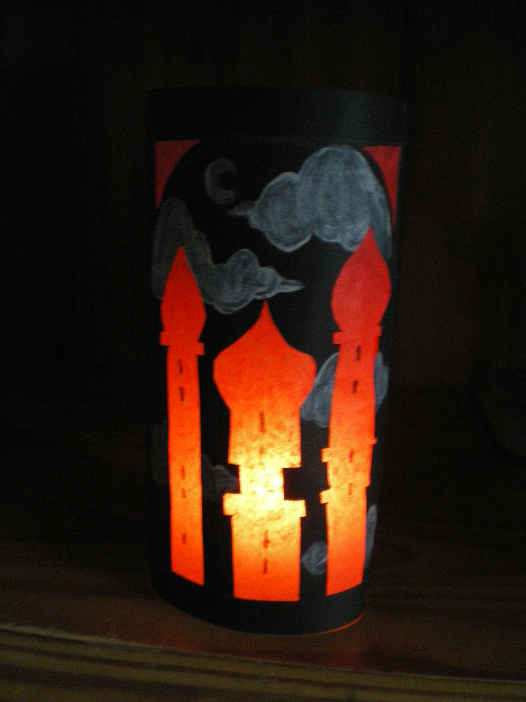
Arabian Nights lantern
Here was a quick experiment with black card and painting white clouds behind the arabian style buildings. The black lanterns has a much darker feel and highlights the red light up bit very well. In the darkness you only really see the buildings and the clouds, so the design seems to be floating in the gloom, which looks very cool.

Subscribe to:
Posts (Atom)